I began my Final Major Project by collecting a wide range of research from Primary and Secondary sources. I collected examples of illustration styles that I was inspired by from leaflets and music festival posters, and typography styles that I thought I could recreate. In my first research sketchbook that contains my three initial ideas, I collected cards and gift wrap from Paperchase which reflected the style that I wanted to work in for this project. I also collected images and photocopied pages from books that contextually influenced my project, for example ‘The Collins Pocket Guide to Stars and Planets’ by Ian Ridpath and Will Tirion, and the astronaut Chris Hadfield’s Autobiography about his time in space, which included his own photographs taken from the International Space Station and space walks that he undertook. Although my final motifs that I used in my surface pattern designs were influenced by secondary imagery that I saw, the Primary imagery I collected helped to influence my decision making and which direction I was going to take my project in early on. I used photography that I had taken of the moon, of rocks and crystals, and of an Airfix model I had of the Lunar Lander and astronauts. These helped me to define what I could potentially draw for my individual motifs, and inspired me to collect Secondary research to draw from. Although I am pleased with the amount of Primary research that I collected, I could have used them more in my project, and I should have used my photography to draw from at the beginning of my project instead of mainly drawing from secondary sources. I also should have responded more to the research I collected in my sketchbook instead of just annotating it, for example by drawing in a similar style or colour. I visited the Planetarium at the Centre for Life in Newcastle and saw a show about the Hubble Telescope, and I later revisited this research by collecting secondary research of photographs taken by the telescope, which I wanted to recreate using a marbling technique. My visual research is mainly contained in my first two research sketchbooks, however I took some photographs of the ‘BALTIC to the moon’ mural next to the BALTIC in Newcastle as I was inspired by the style of collage used and the fact that it was produced by my target audience, which I have displayed in my development sketchbook. I was also influenced by the collage style I found in some gift cards I bought from the BALTIC shop. I used this research to produce some collage versions of my line drawings, and although I liked this technique I wasn’t sure that this was the effect I wanted to work in. Most of my line drawings were influenced by secondary research from artists and designers, however I did produce some from the space themed gift wrap that I bought from Paperchase as initially I wanted to work in fineliner and watercolour, and I thought I could recreate the digital collage that the designer at Paperchase had used in my own hand-drawn way.
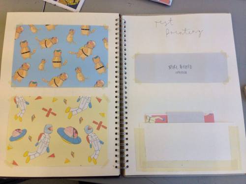
After I had collected Primary research I then started looking into the work of artists and designers that influenced my drawing style and the ideas behind my project. In my research sketchbook I began by looking at examples of stationery collections, especially notebooks as I thought that this was where the emphasis for my project lay. I also looked at what other artists drew as motifs to represent space, which later helped me come up with a list of objects to draw including spaceships, rockets, stars, astronauts, robots, planets and satellites. I then looked at the work of illustrators that I was influenced by stylistically. I looked at the work of Rachel Powell who creates playful prints for card and gift and interiors in the style and colour palette that I wanted to experiment with. I then looked at the work of Brooke Weeber as she produces a lot of the items that I wanted to develop, for example badges and stickers. She uses her hand drawn water coloured illustrations to develop into motifs which is the direction I initially wanted to go in with this project. In my research sketchbook I also looked at Lily Louise Scott’s surface patterns based on her small scale illustrations of people and quirky objects. Again, she works by hand and composes her pieces digitally, which is a method I wanted to experiment with and develop. From this research I began to experiment with using watercolour and fineliner in my sketchbook and, although I liked this technique it is the way I usually work and I wanted to develop another way of colouring up my pieces. After exploring some different drawing techniques in my sketchbook I chose to draw my line work by hand and scan in my artwork to refine digitally. I realised that I needed to do some more research into drawing figuratively, so I explored this within my research sketchbook and revisited it later when deciding on which motifs to use. I did some research into types of prints, for example conversational prints, placement prints, formal repeats and mirror repeats. I worked out that for my notebook covers and gift wrap I would use a conversational print as it is more playful and has a strong narrative feel, so therefore appeals to my target audience. I could then take aspects from my prints to use in the gift tags, invitations, stickers and greetings cards. Lastly I explored different ways to bind my notebooks, for example ring binding using wire, pamphlet binding by sewing with a running stitch down the spine, saddle stitching using a stapler and Japanese binding which is the most decorative.
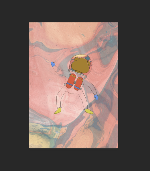
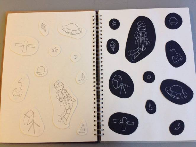
From my research I then experimented with different drawing methods and materials to use. Although I enjoyed using watercolour and fine liner I wanted to try a different method of working to the way I normally work. I experimented with using collage in my development sketchbook which I think worked really well, however I wanted to learn new skills in Photoshop and colouring my work digitally so I also experimented with this. From my initial research into the Hubble Telescope, I experimented with using marbling to recreate the photographs of galaxies that it takes. To do this I filled a tub with water and poured paint onto the surface of the water, using a cocktail stick to swirl the paint around. Initially I used watered down acrylic paint which did not have the intense colour that I wanted and did not float on the surface of the water very well. I then tried using nail varnish which worked better, however I had to do this on a small scale due to the amount of nail varnish it used. The nail varnish also dried too quickly so I had to work fast or it would dry before it was transferred to the paper. I found that using spray paints worked perfectly as I could use a larger tub of water and dip A3 pieces of paper into it, which meant that the pattern created by the paint had more room to develop and spread across the water so it was more intricate, and I also had longer to work as it did not dry as quickly. After I had scanned my marbling with spray paint into Photoshop I experimented with changing the colour using the selective colour tool and adjusting the levels. I also tried using my marbling as backgrounds for the notebook pages and wrapping paper. I began to photocopy my marbling and collage it into my line work by hand, however I leant that I could do this digitally by selecting my line work with the magic wand tool, moving to the marbling layer, selecting ‘select-inverse’ and deleting the marbling around the line work. I also learnt how to fill in areas of my motifs with block colour by using the lasso selection tools, which meant I could offset the colour slightly from the line work. I revisited my research about different types of book binding and I experimented with these styles in my sketchbook. I found that although I liked the style of Japanese binding, it was too distracting from the notebook cover and it required a large margin or a landscape notebook as the stitching took up a lot of room down the margin.
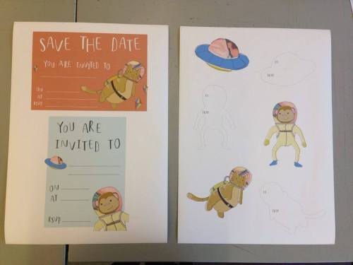
I had selected the theme of space for my project as I had wanted to target my stationery towards younger children, and space was a subject I was very interested in as a child. From my experimentation I learnt that the more simplistic styles of line work worked the best, and that although I wanted to create a lot of my work by hand, once I had developed my skills in colouring up digitally, I realised that this created the effect I had wanted to achieve by hand. I am pleased that I learnt how to colour my line work using Adobe Photoshop as this is something I had wanted to learn in previous projects and is definitely something I will be able to use in the future to create my work. From experimentation I refined my motifs down as I didn’t want to include too many different objects as I thought this could get confusing, especially for my target audience. I refined this down to astronauts, space ships, rockets, diamonds and satellites, as well as including shapes such as triangles and circles. My tutor suggested I did some more research and experimentation with drawing figuratively and to maybe include animals as well as human astronauts. I decided to look at cats and monkeys as they were sent into space by NASA to test conditions for humans, and I thought that I could draw these in a more simplified style to suit my theme and audience. I hadn’t initially thought of using animals in my project however I think that it brings a more playful and fun aspect to my stationery and gives my surface designs more of a narrative, which works well for the birthday cards and invitations. I also developed my ideas for the colour scheme of my card and gift collection. I initially wanted to reflect the colours found in photographs of the galaxies and areas in space, such as deep blues and purples, and I wanted to create this using watercolour and white pen to represent stars. When I experimented with collage however, both digitally and hand-rendered, I found that I preferred block colours and purples and blues didn’t suit my target audience. I then created some colour palette boards in my development sketchbook, and found that I preferred the boards with a primary colour scheme, which I experimented with digitally. I am glad that I decided to change my colour scheme as I think that my final pieces would not have worked as well if they had been in the initial purple and blue colour scheme, and I think that the block colour works much better than trying to create a galaxy effect with watercolours.
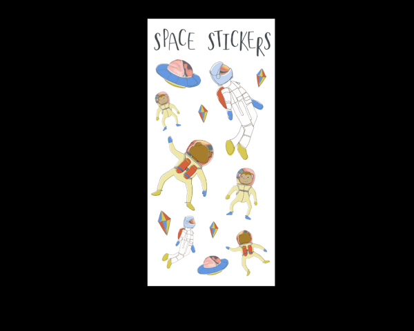
For my final pieces I produced a set of surface designs reflecting the theme of space, which I was able to manipulate and apply to notebooks, gift tags, greetings cards, party invitations and stickers by using my motifs combined with my hand drawn type. I wanted to target my card and gift collection towards children so I experimented with my colour scheme and the simplicity of my motifs so that they were remained exciting and engaging but were not too complicated or messy. I also tried to create final pieces that were relevant to my target audience, which is why I focussed more on the party invitations and stickers instead of the badges. I tried printing my final pieces on the normal Xerox printer at college, however the greetings cards and notebook covers were too flimsy and the colour was not as vivid as I had wanted, so I experimented with printing on the Epson printer instead which worked much better. My initial three ideas were all illustration based, ranging from an illustrated recipe book, to stationery design, and a pop-up book for children illustrating the alphabet by using animals that represent each letter. I think I have selected the strongest idea from my initial three ideas, as it combines the illustration aspect from each idea with stationery and card and gift design which is what I am interested in doing on my course at University. In my statement of intent I said I wanted to produce a collection of items appealing to children, that are exciting and engaging and that work together as a set. I think that I have satisfied this criteria as I feel that my final pieces are colourful and exciting, and by using motifs of animals as well as space-themed objects I feel that I have successfully targeted by card and gift collection to a younger audience. It was also said in the feedback from the final presentation that my collection looks a lot more professional and works well together, especially since I have printed the notebooks, cards, gift tags and invitations on the Epson printer.
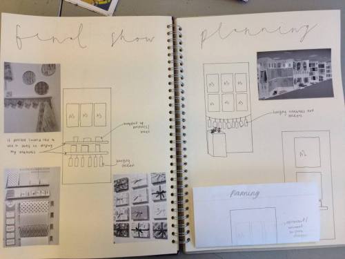
In previous projects I think I have focussed too much on the presentation of the work in my sketchbook rather than the ideas and exploring a range of techniques crucial to the progress of my project. For my Final Major Project I wanted to move out of my comfort zone and explore different ways of working and presenting my work, which meant that I had to work more quickly in my sketchbook. I think that this was a good idea as I began to explore different colour palettes, working by hand or digitally, creating my own type to use, and experimenting with new ways of using colour, for example using spray paints to create A3 marbling pieces. I do feel that the presentation of my research in my first two sketchbooks could be improved however, as there could be more annotation and more drawing responses to the research that I had collected. I am pleased with the presentation of my final pieces, as I took care to use the eyedropper tool in Photoshop when colouring my motifs so that they all fitted together in the set. I also used the eyedropper tool when creating my different pieces, for example the cards and invitations, and changed the colour by lowering the opacity or adjusting the colour slightly. For my final show I want to display most of the final pieces that I have created, as I want my show to resemble that of a Textiles display rather than a Graphic Design one which are generally more minimal, however I need to be careful that this does not make my display too busy or distracting from the final pieces. I will print my stickers out onto A3 vinyl sheets and cut them out. I will also print rolls of wrapping paper and possibly wrap presents up with it to show what it would look like. I can then attach my gift tags to show how they work as a set. To display these products alongside the surface designs that I used to create them, I was thinking of using a shelf or a piece of string to display my notebooks, cards and stickers across the boards. I will also print some of my surface designs out to display, either at A3 or A2 size depending on how much I decide to display on the rest of the board.
During this project I have improved my surface design skills and my ability to use Photoshop to compose my designs and colour up my motifs. Although I was reluctant to work digitally, I learnt that I can still work in the style I want to and I can keep my work looking hand drawn, but I can clean it up and compose it on the computer which looks a lot cleaner and more professional. I am pleased with the skills I have developed digitally and I will definitely use this method of working when it comes to colouring up my pieces at University. This has also left me more open to using Photoshop and other digital software to refine my work, which I was previously reluctant to do. I have learnt to rely less on my hand-rendered art work, as it can be altered and improved digitally, but to focus more on the ideas and the direction of the project as a whole. I also learnt how to organise my time effectively and to stick to my time plan, and because of this I feel that I did not fall behind in my project and I was able to accomplish what I wanted to for the deadline. I enjoyed exploring new ways of working, such as using spray paints to create a marbling effect, and I may use this technique in future projects. I think that this project has improved my confidence in surface design which is what I want to progress onto, and has allowed me to develop new skills, especially in digital colouring and composing, which will help me develop my ideas faster and more effectively in the future.